1
2
3
4
5
6
7
8
9
10
11
12
13
14
15
16
17
18
19
20
21
22
23
24
25
26
27
28
29
30
31
32
33
34
35
36
37
38
39
40
41
42
43
44
45
46
47
48
49
50
51
52
53
54
55
56
57
58
59
60
61
62
63
64
65
66
67
68
69
70
71
72
73
74
75
76
77
78
79
80
81
82
83
84
85
86
87
88
89
90
91
92
93
94
95
96
97
98
99
100
101
102
103
104
105
106
107
108
109
110
111
112
113
114
115
116
117
118
119
120
121
122
123
124
125
126
127
128
129
130
131
132
133
134
135
136
137
138
139
140
141
142
143
144
145
146
147
148
149
150
151
152
153
154
155
156
157
158
159
160
161
162
163
164
165
166
167
168
169
170
171
172
173
174
175
176
177
178
179
180
181
182
183
184
185
186
187
188
189
190
191
192
193
194
195
196
197
198
199
200
201
202
203
204
205
206
207
208
209
210
211
212
213
214
215
216
217
218
219
220
221
| import os
import warnings
from glob import glob
import pandas as pd
import seaborn as sns
from matplotlib import pyplot as plt
from matplotlib.ticker import MaxNLocator
warnings.filterwarnings("ignore")
class vis_data:
def __init__(self, file_name, data, degree):
self.time = file_name[-12:-4]
self.data = data
"""
NOTE: "벤처기업부설연구소", "중견기업부설연구소", "중소기업부설연구소"를 제외한 모든 업종은 박사 전문연구요원으로 간주
과기원
과기원부설연구소
국가기관 등 연구소
기초연구연구기관
대기업부설연구소
대학원연구기관
방산연구기관
벤처기업부설연구소
자연계대학부설연구기관
정부출연연구소
중견기업부설연구소
중소기업부설연구소
지역혁신센터연구소
특정연구소
"""
os.makedirs("prop", exist_ok=True)
DIR_NAME = ["ALL", "MS", "PhD"]
self.degree = DIR_NAME[degree]
self.dir = os.path.join("prop", DIR_NAME[degree])
os.makedirs(self.dir, exist_ok=True)
if degree == 1:
self.data = self.data[
(self.data["업종"] == "벤처기업부설연구소")
| (self.data["업종"] == "중견기업부설연구소")
| (self.data["업종"] == "중소기업부설연구소")
]
elif degree == 2:
self.data = self.data[
~(
(self.data["업종"] == "벤처기업부설연구소")
| (self.data["업종"] == "중견기업부설연구소")
| (self.data["업종"] == "중소기업부설연구소")
)
]
self.data["위치"] = (
self.data["주소"]
.str.replace("서울특별시 ", "서울특별시")
.str.replace("경기도 ", "경기도")
.str.split(" ")
.str[0]
.str.replace("서울특별시", "서울특별시 ")
.str.replace("경기도", "경기도 ")
)
self.ranked_data_org = self.data.sort_values(
by=["현역 복무인원", "현역 편입인원", "업체명"], ascending=[False, False, True]
).iloc[:, [1, 14, 15, 16]]
self.ranked_data_new = self.data.sort_values(
by=["현역 편입인원", "현역 복무인원", "업체명"], ascending=[False, False, True]
).iloc[:, [1, 14, 15, 16]]
plt.rcParams["font.size"] = 15
plt.rcParams["font.family"] = "Do Hyeon"
def time_tsv(self):
print("WRITE TIME SERIES TSV")
with open(f"prop/time.tsv", "a") as f:
for name, _, a, b in self.ranked_data_org.values:
f.writelines(f"{self.time}\t{name}\t{a}\t{b}\n")
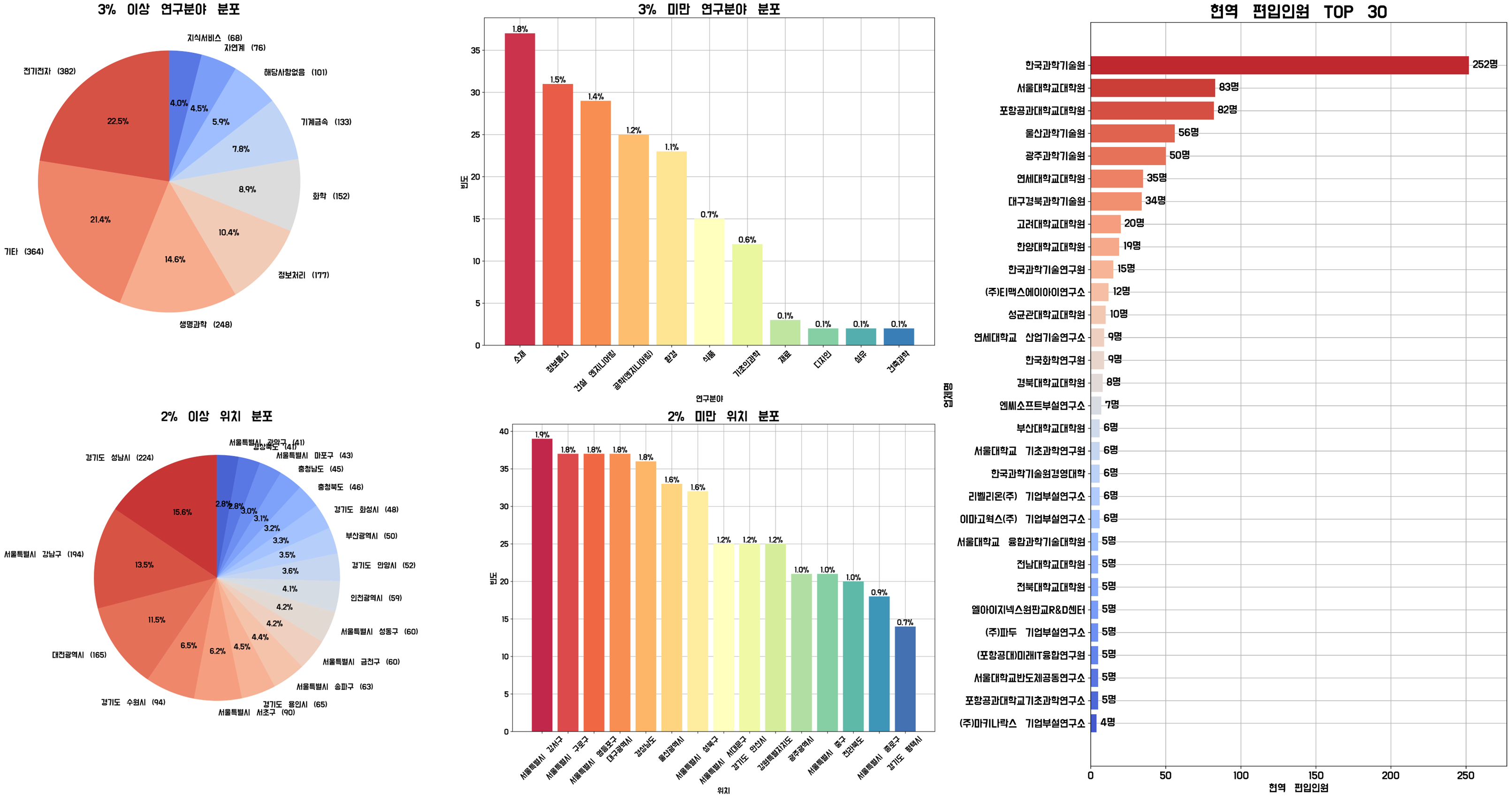
def pie_hist(self, tar, threshold=3):
print("PLOT PIE & HIST:\t", tar)
field_counts = self.data[tar].value_counts()
large_parts = field_counts[field_counts / len(self.data) * 100 >= threshold]
small_parts = field_counts[field_counts / len(self.data) * 100 < threshold]
large_parts_labels = [
f"{i} ({v})" for i, v in zip(large_parts.index, large_parts.values)
]
plt.figure(figsize=(30, 10))
plt.subplot(1, 2, 1)
colors = sns.color_palette("coolwarm", n_colors=len(large_parts))[::-1]
plt.pie(
large_parts,
labels=large_parts_labels,
autopct="%1.1f%%",
startangle=90,
radius=1,
colors=colors,
)
plt.title(f"{threshold}% 이상 {tar} 분포", fontsize=25)
plt.subplot(1, 2, 2)
plt.grid(zorder=0)
small_parts = small_parts[:15]
colors = sns.color_palette("Spectral", n_colors=len(small_parts))
bars = plt.bar(
small_parts.index,
small_parts.values,
color=colors[: len(small_parts)],
zorder=2,
)
for bar in bars:
height = bar.get_height()
percentage = (height / len(self.data)) * 100
plt.text(
bar.get_x() + bar.get_width() / 2,
height,
f"{percentage:.1f}%",
ha="center",
va="bottom",
)
plt.xlabel(tar)
plt.ylabel("빈도")
plt.xticks(small_parts.index, rotation=45)
plt.title(f"{threshold}% 미만 {tar} 분포", fontsize=25)
plt.savefig(f"{self.dir}/{tar}.png", dpi=300, bbox_inches="tight")
def rank_vis(self, by="현역 복무인원", top=30):
print("PLOT RANK:\t", by)
plt.figure(figsize=(10, int(0.6 * top)))
plt.grid(zorder=0)
colors = sns.color_palette("coolwarm", n_colors=top)
if by == "현역 복무인원":
bars = plt.barh(
self.ranked_data_org["업체명"][:top][::-1],
self.ranked_data_org[by][:top][::-1],
color=colors,
zorder=2,
)
elif by == "현역 편입인원":
bars = plt.barh(
self.ranked_data_new["업체명"][:top][::-1],
self.ranked_data_new[by][:top][::-1],
color=colors,
zorder=2,
)
MAX = bars[-1].get_width()
for bar in bars:
width = bar.get_width()
plt.text(
width + MAX * 0.01,
bar.get_y() + bar.get_height() / 4,
f"{width}명",
ha="left",
va="bottom",
)
plt.xlabel(by)
plt.ylabel("업체명")
plt.xlim([0, MAX * 1.1])
plt.title(f"{by} TOP {top}", fontsize=25)
plt.savefig(
f"{self.dir}/TOP_{top}_{by.replace(' ', '_')}.png",
dpi=300,
bbox_inches="tight",
)
def rank_readme(self, top=0):
print("WRITE README.md")
with open(f"{self.dir}/README.md", "w") as f:
if top == 0:
f.writelines(
f"<div align=center> <h1> :technologist: 전문연구요원 현역 복무인원 순위 :technologist: </h1> </div>\n\n<div align=center>\n\n|업체명|현역 배정인원|현역 편입인원|현역 복무인원|\n|:-:|:-:|:-:|:-:|\n"
)
for name, a, b, c in self.ranked_data_org.values:
f.writelines(
f"|[{name}](https://github.com/Zerohertz/awesome-jmy/blob/main/prop/time/{name.replace('(', '').replace(')', '').replace('/', '').replace(' ', '')}.png)|{a}|{b}|{c}|\n"
)
else:
f.writelines(
f"<div align=center> <h1> :technologist: 전문연구요원 현역 복무인원 순위 TOP {top} :technologist: </h1> </div>\n\n<div align=center>\n\n|업체명|현역 배정인원|현역 편입인원|현역 복무인원|\n|:-:|:-:|:-:|:-:|\n"
)
for name, a, b, c in self.ranked_data_org.values[:top]:
f.writelines(
f"|[{name}](https://github.com/Zerohertz/awesome-jmy/blob/main/prop/time/{name.replace('(', '').replace(')', '').replace('/', '').replace(' ', '')}.png)|{a}|{b}|{c}|\n"
)
f.writelines("\n</div>")
def plot_time(self):
os.makedirs(f"prop/time", exist_ok=True)
time_data = pd.read_csv(
f"prop/time.tsv", sep="\t", header=None, encoding="utf-8"
)
for name in time_data.iloc[:, 1].unique():
print("PLOT TIME SERIES:\t", name)
self._twin_plot(time_data, name)
plt.savefig(
f"prop/time/{name.replace('(', '').replace(')', '').replace('/', '').replace(' ', '')}.png",
dpi=100,
bbox_inches="tight",
)
plt.close("all")
def _twin_plot(self, data, name):
tmp = data[data.iloc[:, 1] == name]
x, y1, y2 = (
pd.to_datetime(tmp.iloc[:, 0], format="%Y%m%d"),
tmp.iloc[:, 3],
tmp.iloc[:, 2],
)
_, ax1 = plt.subplots(figsize=(20, 10))
plt.grid()
ax1.plot(x, y1, "b--", linewidth=2, marker="o", markersize=12)
ax1.set_xlabel("Time")
ax1.set_ylabel("현역 복무인원 [명]", color="b")
ax1.tick_params("y", colors="b")
ax2 = ax1.twinx()
ax2.plot(x, y2, "r-.", linewidth=2, marker="v", markersize=12)
ax2.set_ylabel("현역 편입인원 [명]", color="r")
ax2.tick_params("y", colors="r")
ax1.yaxis.set_major_locator(MaxNLocator(integer=True))
ax2.yaxis.set_major_locator(MaxNLocator(integer=True))
try:
m = self.data[self.data["업체명"] == name]["현역 배정인원"].iloc[0]
plt.title(f"{name} (현역 배정인원: {m}명)")
except:
plt.title(f"{name} (현역 배정인원: X)")
|